
Many companies often skip a critical step in their data analytics projects and then wonder why these initiatives fail. The fundamental issue lies in overlooking the transformation of dashboards into app-like interfaces that truly cater to user needs. In these scenarios, data analytics projects flounder because users struggle to understand the data or perceive it as irrelevant. This problem is exacerbated by the rapid development capabilities of BI tools like Tableau, Power BI, or Looker which prioritize speed but often disregard the crucial factor of the user experience (UX).
To rectify this, organizations must prioritize a user-centric approach that places a strong focus on UX. This entails ensuring usability and answering the “why” behind the data rather than simply presenting the information. Additionally, involving stakeholders throughout the project’s lifecycle is essential to ensure alignment with their expectations and needs, thereby enhancing the dashboard’s value.
Furthermore, the integration of a prototyping process becomes paramount. Prototypes save both time and money by facilitating rapid iteration and garnering valuable feedback, all while ensuring engagement and usability. Stakeholders can interact with tangible representations of the dashboard, aligning it more closely with actual user needs and significantly reducing the risk of costly revisions. By adopting a user-centric mindset, actively involving stakeholders, and incorporating prototyping, companies can create analytics that resonate with users, increase the chances of project success, and optimize resource utilization.
The foundation of any successful project is a clear and concise one-page requirement document. This document serves as the source of truth for the entire project, outlining your objectives, scope, and expectations. It ensures that everyone is on the same page from the start, setting the stage for a successful data project.
During this step, focus on gaining a deep understanding of your data. Begin by reviewing its structure and identifying potential opportunities. Define the central focus, often referred to as the “Data Hero,” for your dashboard. Analyze data trends and determine whether real-time or near-time updates are necessary to align with your project goals. Collaboration with your team is crucial during this phase to ensure that everyone is on the same page and comprehends the insights derived from data exploration.
It’s important to note that usually, UX designers are not well-versed in data intricacies. Therefore, it’s vital to ensure that your UX design approach incorporates analytics and data understanding to effectively communicate data-driven insights.
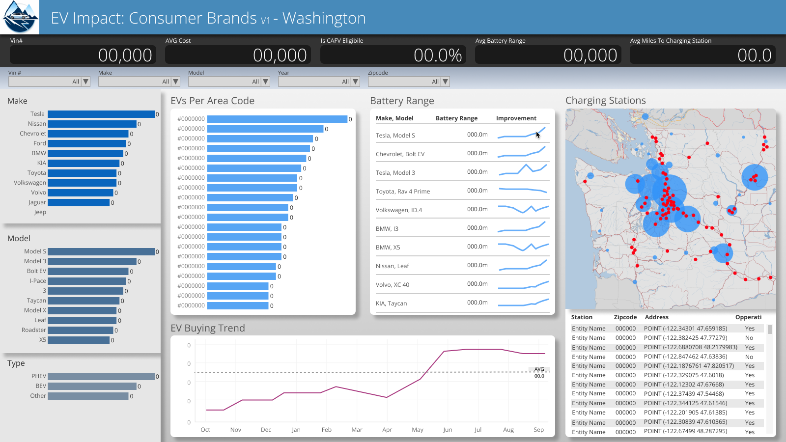
Using Figma, we swiftly create interactive prototypes for your data analytics solution. This enables quick visualization of how your data will be presented, aligning it with your project goals and user needs. Figma’s real-time collaboration ensures engagement from your team throughout. Importantly, we can enhance user understanding by incorporating animations within Figma, showcasing data interactions. By utilizing a custom design system tailored to your requirements, we apply established design patterns and components. This expedites prototype creation, maintains consistency, and fosters a user-centric approach. Our efficient use of this custom design system within Figma allows for iterative refinement, reducing the risk of costly revisions and enhancing project efficiency.
In Step 4, we emphasize collaboration as we review the one-page requirement document, assess expected behavior shifts resulting from the data analytics solution, and discuss its functionality in detail. This process ensures that everyone on the team is aligned and understands the project’s objectives. Any necessary adjustments or improvements are openly discussed, documented, and agreed upon, fostering a shared vision and commitment to moving forward together with a clear understanding of the project’s scope and goals.
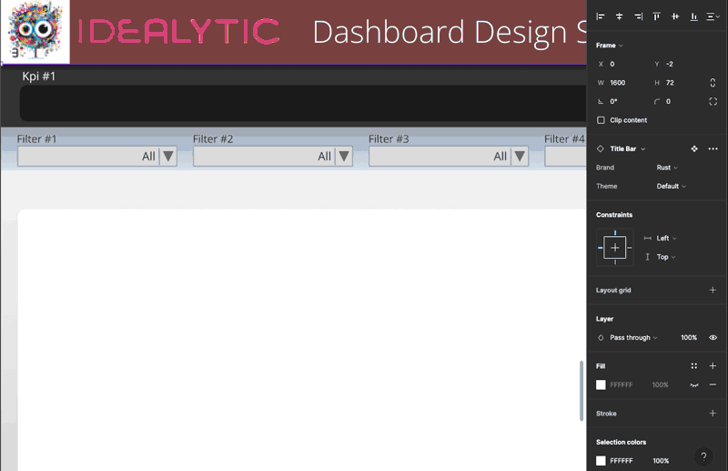
we transition from design to implementation by exporting your design from Figma into your preferred Business Intelligence (BI) tool. This process involves turning off all the text layers in Figma and exporting the design as a JPEG or PNG file. The beauty of this step is that all major BI tools support the import of images, making the transition seamless. Once your design is imported, you can start building your graphs and dashboards using drag-and-drop functionality. This step marks the exciting shift from design to actionable data insights, as you transform your visual concepts into dynamic, data-driven representations.